skip to main |
skip to sidebar
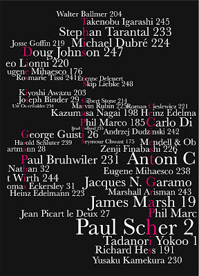 This was a piece of work Jay Flaxman and I produced to represent the design magazine Graphis. The concept behind this includes the three languages the magazine focuses on and designers that have designed front covers for the magazine over the years. The magazine is also heavily type based. These are all aspects we wanted to represent through this poster which was screenprinted at A2.
 Hidden within this image is the word serenity
 Within this image is the word fish
 This is a design for the 'Mrs Kipling' range I produced for my final major project, the packaging designs were based on a more home-made range such as brownies and cookies. The designs were chocolate brown and cookie dough cream colour, they were easy to pack and included a window and photographs of the food were on the packaging.


